June 26, 2026
10 min
Discover practical strategies to improve patient retention, strengthen trust, encourage referrals, and create lasting relationships that support sustainable dental practice growth.
October 28, 2025
9 min
Six-step dashboard roadmap: ask the question, verify data health, spot trends, map the funnel, attribute properly, and prioritize fixes — templates, KPIs, and tests to turn dashboards into decisions.

If you’re a marketing manager, CMO, agency lead, or you run a practice, including healthcare or dental, yes, this is how you can reliably extract answers (not just data points) from dashboards without flailing. Expect about 15 minutes of reading (it isn’t short, but clarity rarely is). When you finish, you’ll have a concrete process, a table that translates metrics into decisions, annotated dashboards, tailored industry variations, a decisive checklist, and analytic queries your team can steal or build.
If there’s a meta-skill for marketers, it’s learning not to overreact to numbers. This checklist turns the anxiety of data dumps into a habit: move from question, check the plumbing, spot signals, then decide. Repeat it every single time.
Step 1 – Start With the Question
Dashboards, without a question, are how teams go in circles. Decide on the single thing this dashboard is trying to reveal (Is acquisition working? Is churn hiding somewhere? Are we efficient?), and who actually needs the answer? Now you’re allergic to vanity metrics by default.
Step 2 – Data Health is Not Optional
Ignore data quality, and you’re the person who acts on illusions. Audit your connectors, source ingest rates, freshness, and basic tracking sanity. Tools help, but even a manual scan for broken tags or sudden missing events exposes landmines early.
Dental/Healthcare Sidebar: If you don’t validate your PMS/EMR and scheduler syncs, “marketing ROI” is just a guess. Attribution only happens when your clinic’s systems talk to your lead sources. The best platforms surface this up front. To understand and improve marketing ROI for dental practices, it’s useful to study guides focused on marketing ROI analytics for dentists.
Step 3 – Spot Real Trends, Ignore Randomness
Moving averages aren’t a luxury; they’re your shield against impulsive over-corrections. Compare week or month blocks, then scan for spending and traffic moving together. If they split, find the implementation or tagging fault before changing the campaign.
Step 4 – Walk the Funnel
Whose journey is leaking? Map the steps from curiosity (acquisition) to action (activation, conversion, retention). Find where the most users bail. Clinics especially: spot the lead-to-appointment-to-treatment drops; often it’s a bottleneck like no-shows or slow bookings that you can fix. Effective patient retention strategies can help address common drop-off points.
Step 5 – Slice and Attribute
No dashboard is true in aggregate. Split by cohort, channel, geo, device, and creative, then add multi-touch if you actually want to know what’s working. Big bucks on attribution? Reserve real lift/incrementality testing for those; otherwise, you’re just shifting ad dollars based on noise.
Step 6 – Fix the Right Things First
Rank by impact and effort. Triage tracking and hygiene (broken links, bad UTM, missed routes) before heavy lifts. Fastest wins come from short-burst creativity or landing tweaks, not weeks spent on platform rewrites.

If the metrics can’t tell you what to do next, they’re noise. Here’s what you need to know: definitions, red flags, shortcuts to doesn’t-smell-right, and minimal benchmarks. Use this as a field guide; paste it on the office wall. For dental teams, tracking key performance indicators for dental practices brings real clarity to growth and efficiency.
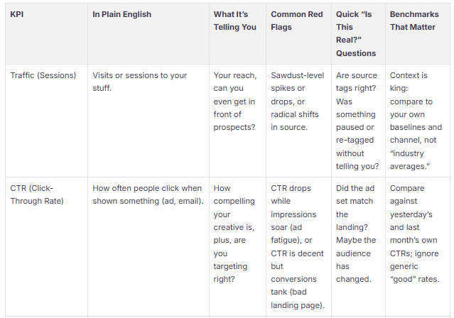
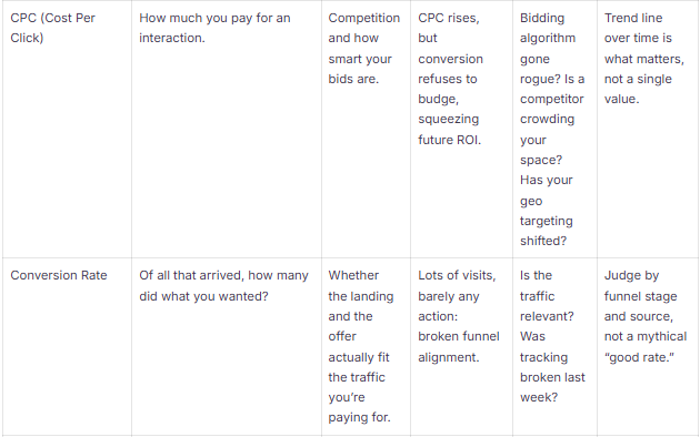
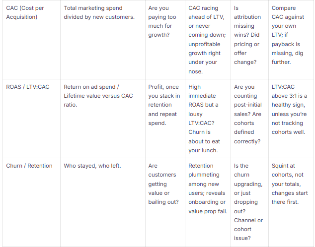
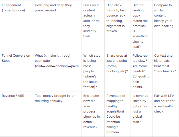

Note for obsessives: Mix leading and lagging metrics; use the first (like traffic, CTR, and signups) to preempt slumps and the latter (revenue and churn) to prove that something’s working. Always compare cohorts over time and split by channel to prevent blind spots.
You can’t escape data hygiene. If you’re not running source checks, monitoring ingestion, and tracking plan errors, every insight is built on sand. The minimalist’s routine: check connector status, tagging hygiene, timezone mismatches, and PMS/CRM match rates every week, especially vital in healthcare.
Multi-touch attribution is good for pulse-checking channel contributions and audience segments, but when you need to stake real money, do a randomized lift test; otherwise, you’re trading precision for a false sense of certainty.
Templates are cheap, but annotation is where skill shows up: Here are playbooks you can deploy instantly, how to orient yourself, what to say in stakeholder meetings, and what actions to propose (plus the filters that help you go from “hmm” to “let’s do x”). Dental-specific dashboards often benefit from using unified data dashboards for clinics to centralize patient and practice metrics.
How to Annotate Charts So People Trust Them
Attribution and Causality: Avoid Self-Deception
Health Checks to Add to Every Screen
It’s one thing to list "metrics that matter," another to see which ones matter where. Here’s what sharp marketers do in SaaS, e-commerce, B2B, consumer apps, and dental/DSOs: what to focus on, what trips up teams, and examples you can actually use.
If you’re tired of tracking errors messing up your week, use dashboards that monitor sourcing/ingestion and auto-flag tracking errors. Clinics: pick tools that include call-tracking and match to PMS at high rates. The less you manually stitch, the less you miss.
1) Is my sample size giving lies? If the window is short, expect swings. Pool into weekly or monthly views; don’t act hastily based on spotty data.
2) Attribution conflicts, what do I do? Different attribution schemes fight on any channel report. For short-term signals, multi-touch works; for investment moves, validate with real experiments.
3) Spike: Noise or Signal? Trust source stability, timeframe alignment, and if there’s a clear campaign/event match. Small, revenue-free “spikes” are almost always noise; wait them out or cross-check with a control group.
4) Are vanity metrics evil? Yes, on their own. Only combine with activation and revenue to learn anything that matters.
5) Real-time or aggregate? Use real-time for troubleshooting and delivery; reserve big decisions for cleaned, deduplicated, aggregate data.
Most dashboard frustration is self-inflicted: not knowing the question, reacting before you confirm the signal, or skipping steps to impress someone fast. Experts slow down enough to sanity check, hunt for bottlenecks, consider cohort splits, and only then move. Do this, and you convert dashboards from pretty charts into unfair advantages. In clinics and healthcare, double down on PMS and source connections; real insights live there, not in aggregate numbers. If you want faster clarity and fewer reconciliations, integrated analytics (dashboard + CRM + attribution) pays off fast, especially as you scale locations.
Run the 6-step process each time you load a dashboard. You’ll replace guesswork with actual answers and raise the average IQ of every meeting it touches.


June 26, 2026
10 min
Discover practical strategies to improve patient retention, strengthen trust, encourage referrals, and create lasting relationships that support sustainable dental practice growth.
June 26, 2026
10 mins
Discover the differences between lead tracking and revenue tracking, and learn how connecting marketing efforts to production and collections drives sustainable practice growth.

June 26, 2026
15 min
Discover how to identify patient drop-off points, optimize every stage of the patient journey, improve conversion rates, and turn more inquiries into booked appointments.
Sign Up Now & Someone from Our Team Will Be in Touch Shortly!
Use the form below to send us a message, and we’ll get back to you as soon as we can.
Track every marketing dollar and optimize patient conversions with ConvertLens. Gain valuable insights from your campaigns, ensuring you never miss a potential patient. Maximize ROI and grow your practice effortlessly.
-p-500.webp)