June 26, 2026
10 min
Discover practical strategies to improve patient retention, strengthen trust, encourage referrals, and create lasting relationships that support sustainable dental practice growth.
October 28, 2025
7 min
Patient journey mapping visualizes every patient touchpoint, emotion, and barrier to improve care delivery, system efficiency, and ROI using real data instead of assumptions.

What is patient journey mapping? At its core, patient journey mapping is a way to make the experience of being a patient visible and concrete. Instead of guessing at patient problems or following the usual hunches, you document what actually happens: every point of contact, every emotion, every obstacle. It's much more than a flowchart; it’s a tool for thinking about care as something people move through, step by step, with systems that can either block or accelerate them. If you want to improve care meaningfully, you need to see the sequence of patient decisions, emotions, and touchpoints, not a fantasy, but what’s there in reality.
Why is this so urgent now? Healthcare is in transition; “patient-centered” is the aspiration, but the daily reality is fragmentation, with digital and in-person touchpoints all over the place. Mapping isn’t just about drawing; it’s about connecting what patients experience to what the data says, so you’re solving the actual friction, not just theorizing about it. When you map, you can stop treating outcomes like mysteries. You can measure and fix things like access, retention, and adherence because you finally see where it’s breaking down.
“Patient journey mapping reveals the headaches you didn’t even know patients had. Solve those, and both care and revenue get better.”
Consider this: Kangaroo Mother Care (KMC) works; about 40% of eligible newborns benefit, but it only reaches about 1% of infants globally. A stark example of how obvious wins get lost when we don’t map out what's really happening on the ground (see case study further on).
When you build a map, you want more than just boxes and arrows. You want clarity. The stages—awareness, intake, diagnosis, treatment, and follow-up—shouldn’t be guesswork. Each stage needs clear patient goals, actual touchpoints, how people feel there, and the data that could prove you’re right about what’s happening. If the table above were here, you’d use it as both a checklist and a lens. Every piece in its place, or you’ll end up with another well-meaning hallucination.
Scope smart: Start with one patient type and service. Make it tight, get real insights, then expand to the full journey. Broad and shallow is useless; narrow and deep is where leverage lives.
1) Pick your slice
Choose one corner of the world, one service, one persona. No need to overreach. (Example: new-patient bookings.) You can do the initial discovery in a focused 4–6 hour workshop with the right people. Learn more about AI-powered appointment booking systems for smoother patient onboarding.
Outcome: a project brief saying what matters, what to measure, and who’s responsible.
2) Build real personas
Don’t invent “Sally the Diabetic” on a whiteboard. Interview 10–20 real people. Make 2–4 profiles that actually reflect goals and blocks found in research.
Outcome: A concise one-pager for each, with goals, obstacles, and the real path taken.
3) Pull in actual data
Blend detailed interviews (aim for 10–15) with a month’s worth of operational logs (EHR, bookings, web activity).
Outcome: A living data sheet with touchpoint counts, wait times, and sentiment snapshots. This is your “reality check.”
4) Draw the real map, touchpoints, and emotions
Start by plotting the literal steps people take right now. Overlay emotion lanes, moments of truth, and points where things break down. (Use Miro, Smaply, or sticky notes in a pinch.)
Outcome: A timeline that makes everyone see what’s happening, not just what they think is happening.
5) Add the backstage system and integration
Don’t stop with what patients see. Add the systems serving those touchpoints: PMS, CRM, and analytics tools. Document what integrations will be needed to actually track and fix this mess. Budget 2–3 hours to blueprint where the handoffs break down. If you’re in dental, note that platforms like ConvertLens help when you need everything on one dashboard.
Outcome: Service blueprint with system architecture (events, data flows, owners).
6) Pick your shots and co-design solutions
Score every pain point for impact vs. effort. Run design sprints with a cross-section of staff and patients until fixes emerge that are short-cycle and doable.
Outcome: Prioritized, actionable backlog with who owns what and how it’s measured.
7) Pilot, measure, and tune
Run small pilots (4–8 weeks). No more “big bang” launches. Measure your KPIs rigorously, and be relentless about iterating before scaling up.
Outcome: Clear results, what changed, what didn’t, and a real plan for the next iteration.
Kangaroo Mother Care (KMC) in Uttar Pradesh, India
The Community Empowerment Lab and the National Health Mission got tired of reading reports that didn’t change behavior. Instead, they mapped the real journeys of mothers, nurses, and families across clinics and communities. Tools like Smaply made it possible to see how nurse mentorship, emotional support, and family culture determined if KMC reached mothers. Key finding: Even a clinically proven intervention can fail if workflows and emotional architecture in the system don’t put it in patients’ hands. Before mapping, KMC’s uptake was abysmally low despite its clear benefits; after nurse mentorship and workflow redesigns, coverage moved toward ambitious targets.
Dental Practice Journeys (ConvertLens case)
Smaller dental clinics mapped the chain from marketing lead to front desk to check-in through treatment and follow-up. Linking those stages to CRM and scheduling systems, they discovered confusion around how patients found them, friction in booking, and lost appointment reminders. Consolidating with a dashboard/CRM via ConvertLens, teams saw improvements in both visibility and output: marketing ROI got clearer, no-shows dropped, and the cycle from lead to visit was suddenly trackable, in real time, not guesswork.
Seeing the change
Old approach: stories, myths, and disconnected anecdotes. After mapping, gaps in access and scheduling became plain and were quickly fixed. The lesson: Start with access and scheduling; they’re where you get the highest ROI fastest.
Hands-on tip: You don’t have to reinvent wheels. There are ready-made templates, journey maps, and service blueprints you can use instantly to run workshops or pilots.
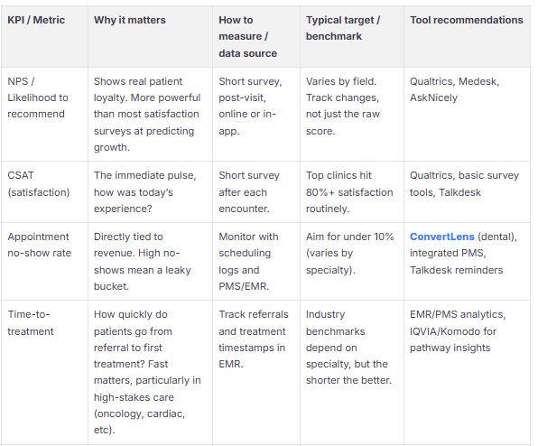

Tie every metric to something a patient wants and something your operation can influence. Lead with access (appointment flow, booking conversion), experience (CSAT/NPS), and outcomes (time-to-treatment, readmissions). Pair a couple of qualitative signals (interviews, stories) with cold, hard data. See how healthcare marketing metrics align with patient experience tracking.
Best-practice summary:
Before integrating any patient-level data, verify every vendor is compliant and ready to sign BAAs. The HIPAA Security Rule isn’t negotiable and enforces controls for data use, storage, access, and incident response. If you touch international data, apply GDPR safeguards and do risk assessments up front. Don’t trust; verify with third-party reviews.
How long does it really take? With focus, you can do a decent current-state map in a single day, plus 1–2 weeks of analysis. If you want to overhaul systems, expect an 8–12 week sprint for end-to-end pilots.
Who must be in the room? Anyone with hands on the process: clinical leads, operations, schedulers, IT, marketing, and crucially, patients or caregivers.
Where do you start? The biggest levers: high-volume or high-impact segments, new patients, high-cost pathways, or wherever you keep seeing missed appointments or high readmissions.
How do you know if there’s ROI? Set a baseline for no-shows, booking conversion, CSAT/NPS, and time-to-treatment; then pilot and look for change in 4–8 weeks.
What do I actually need for tools? Smaply or Miro for mapping, Qualtrics for surveys, and ConvertLens for dental practices (integrates dashboard, CRM, and marketing data).
Privacy/reg guidance: Confirm HIPAA/GDPR coverage before pulling in EHR data; the right BAAs are mandatory. Use HHS guidance for due diligence.


June 26, 2026
10 min
Discover practical strategies to improve patient retention, strengthen trust, encourage referrals, and create lasting relationships that support sustainable dental practice growth.
June 26, 2026
10 mins
Discover the differences between lead tracking and revenue tracking, and learn how connecting marketing efforts to production and collections drives sustainable practice growth.

June 26, 2026
15 min
Discover how to identify patient drop-off points, optimize every stage of the patient journey, improve conversion rates, and turn more inquiries into booked appointments.
Sign Up Now & Someone from Our Team Will Be in Touch Shortly!
Use the form below to send us a message, and we’ll get back to you as soon as we can.
Track every marketing dollar and optimize patient conversions with ConvertLens. Gain valuable insights from your campaigns, ensuring you never miss a potential patient. Maximize ROI and grow your practice effortlessly.
-p-500.webp)