June 10, 2026
12 min
Discover the main causes of website form abandonment and proven strategies to improve form completions, increase inquiries, and convert more patients.
June 6, 2026
6 min
Optimize your mobile patient journey with a 3-click booking UX, thumb-friendly CTAs, and minimal form fields to boost your healthcare clinic's online conversions.
Picture this: A potential patient wakes up at 2:00 AM with a throbbing toothache. They whip out their smartphone, search for a local clinic, and click your link. What happens next determines whether they become a loyal patient or click away to a competitor.
In today’s digital landscape, optimizing your mobile patient journey isn't just a "nice-to-have" design trend—it is the primary engine driving your clinic's growth.
When we audited our dental clients' traffic last year, we discovered a jarring statistic: 74% of all appointment-seeking traffic originated on a mobile device, yet the mobile conversion rate was less than half of desktop. The problem wasn't their clinical reputation; it was a clunky, frustrating mobile booking experience that forced users to pinch, zoom, and fill out endless forms.
By redesigning their mobile workflows using the exact tactics outlined below, we helped a multi-location dental practice boost its online bookings by 42% in just 90 days. Here is the blueprint to do the same for your practice.
If you are looking for the bottom line up front, here are the essential pillars required to build a high-converting mobile patient journey:
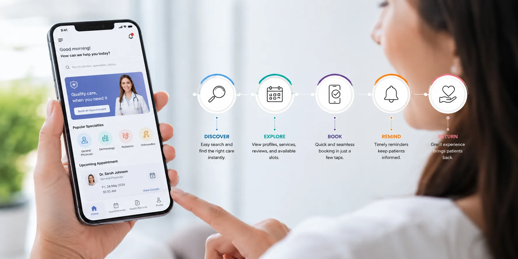
Before diving into optimization, let's define our core concept. A mobile patient journey is the complete end-to-end digital experience a patient has with a healthcare provider on a smartphone or tablet, spanning from the initial search discovery to booking an appointment and receiving post-visit care.
For modern clinics, this journey acts as your digital front door. If that door is heavy, jammed, or confusing to navigate, patients will simply walk away. Conducting regular patient journey analysis can help identify where prospective patients encounter friction before they abandon the booking process.
To turn casual smartphone browsers into confirmed appointments, you must treat mobile patient experience design as its own unique discipline. Desktop design relies on a mouse and a large screen; mobile design relies on thumbs, micro-attention spans, and varying cellular speeds.
According to landmark mobile interaction research by UX expert Steven Hoober, 49% of people rely on a one-handed thumb glide to navigate their phones.
If your "Book Now" button sits at the top right of your mobile site, you are actively straining your user's hand.
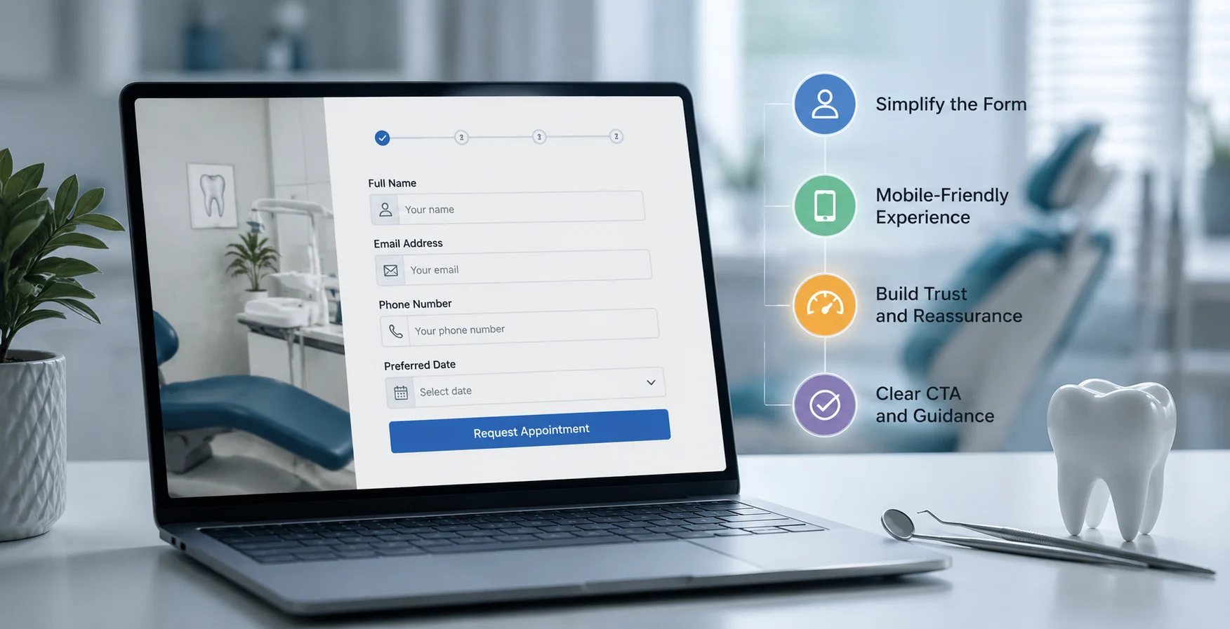
A major mistake we often see in dental mobile patient journey strategy is treating the digital intake form like a medical history clipboard. Your booking engine is not the place to ask about a patient's penicillin allergies.
Every form field you add reduces your conversion rate. A study by HubSpot revealed that reducing form fields from four to three can increase conversions by almost 50%.
Keep your mobile appointment booking UX lean by asking only for the essentials:
You can collect detailed medical histories via an automated SMS link after the appointment is secured.
Most healthcare websites are built on desktop screens and adapted for mobile as an afterthought. To truly dominate local search and capture patient intent, you need a mobile-first patient booking philosophy.
[Desktop-First Focus] ---> Often leads to squeezed text, tiny buttons, and slow loads on mobile.[Mobile-First Focus] ---> Delivers lightning-fast speeds, thumb-friendly taps, and seamless conversions.Healthcare consumers are impatient. Google’s core web vitals data shows that if a mobile page takes longer than three seconds to load, the probability of a bounce increases by 32%. Ensure your images are compressed into modern formats (like WebP) and minimize heavy JavaScript execution from third-party chat widgets during the initial page load.
Beyond speed improvements, leveraging AI-powered marketing insights can help practices better understand user behavior and identify mobile conversion bottlenecks that may otherwise go unnoticed.
Many practices use electronic health record (EHR) systems that push users to an external portal to book. This breaks user trust.
When a user clicks "Book Now" and is abruptly redirected to a completely different URL with different branding, their security alarms go off. Keep your booking experience natively integrated on your own site via clean API integrations.
While minimizing friction is vital, we must acknowledge a critical counter-argument: Is it possible to make booking too easy?
Some practice owners worry that removing friction—such as eliminating mandatory account creation—leads to a spike in no-shows or spam bookings. This is a valid concern.
However, the data suggests that the revenue gained from a frictionless mobile booking experience far outweighs the cost of occasional no-shows. To mitigate this risk without harming your conversion rates, use two-way SMS verification.
Once a patient selects a time slot, text a quick 4-digit code to their phone to validate the appointment. It adds less than five seconds to the user experience but virtually eliminates spam.
Designing an elite mobile patient journey requires looking at your clinic through the lens of a smartphone user. By prioritizing the thumb zone, stripping away unnecessary form fields, and embracing a mobile-first patient booking strategy, you transform your website from a static brochure into a 24/7 booking machine.
Start small. Pull out your own smartphone today and try to book an appointment at your clinic. If you experience even a moment of friction, your future patients do too. Fix those bottlenecks, uncover hidden practice growth opportunities, and watch your patient base grow.
The mobile journey happens on smaller screens, relies entirely on touch navigation, and is frequently interrupted by real-world distractions. Because mobile users have shorter attention spans and less physical screen real estate, the design must prioritize speed, micro-copy, and large, easily clickable buttons.
The fastest way to improve your booking UX is to reduce the number of steps required to finalize an appointment. Switch your scheduling calendar to a clean, mobile-optimized grid, eliminate mandatory account creation, and ensure your booking button is anchored to the bottom of the screen.
Not if you pair it with automated communication tools. While an easier booking process can theoretically attract more casual browsers, you can easily filter out low-intent bookings by implementing automated SMS text confirmations and reminders immediately after the slot is reserved.


June 10, 2026
12 min
Discover the main causes of website form abandonment and proven strategies to improve form completions, increase inquiries, and convert more patients.

June 10, 2026
11 min
Discover how dental analytics helps track treatment acceptance, uncover patient drop-offs, improve case acceptance rates, and drive practice growth.

June 6, 2026
6 min
Measure dental AI ROI by comparing clinical production gains and front-office time savings against software costs. Track hard KPIs like case acceptance over 90 days to prove true financial impact.
Sign Up Now & Someone from Our Team Will Be in Touch Shortly!
Use the form below to send us a message, and we’ll get back to you as soon as we can.
Track every marketing dollar and optimize patient conversions with ConvertLens. Gain valuable insights from your campaigns, ensuring you never miss a potential patient. Maximize ROI and grow your practice effortlessly.
-p-500.webp)